Marketing Agency Website
Overview + Challenge
The Social Brokerage, a Toronto-based marketing agency, needed a polished, on-brand website to attract clients in the beauty industry. Their priorities were to showcase past work, clearly communicate services, and reflect their trendy aesthetic.
View Here →
Tools: HTML, CSS, Bootstrap, Adobe Color, Github
Role: Front-end Developer
Timeline: 2 days
Git Repo →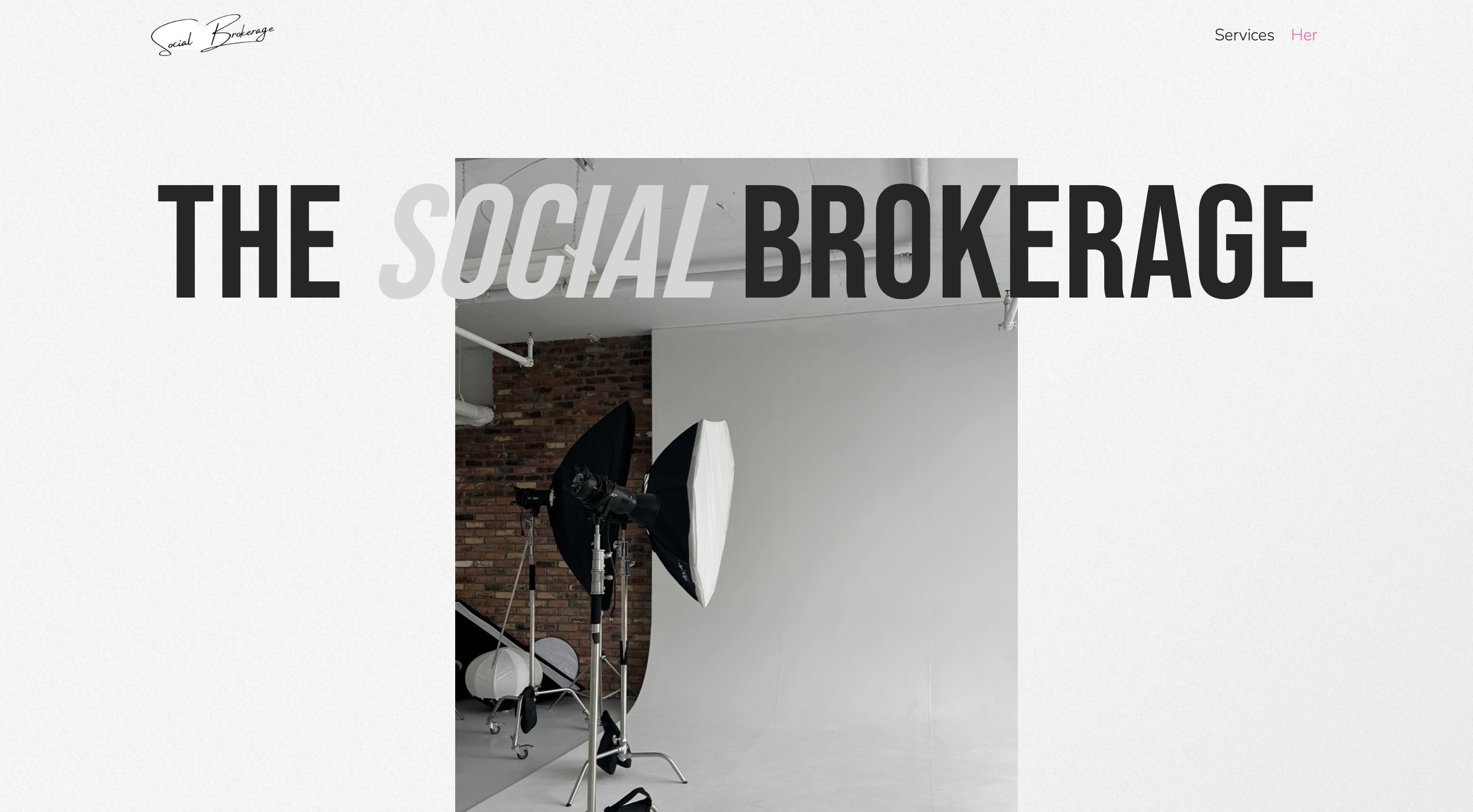
Research
I reviewed the agency's Instagram, searches similar marketing sites, and identified visual patterns that spoke to their niche. This website needed to reflect not only their services, but their client relationships. I leaned into bright colours, clean visuals, and bold typography to reflect that impact.
Ideation
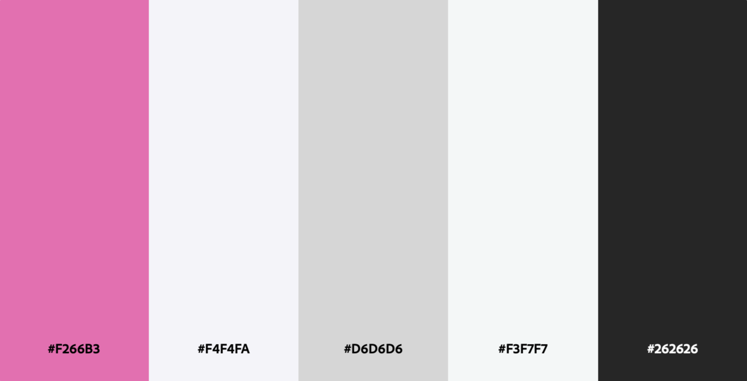
Using Adobe Color, I crafted a palette of white, blush pink, grey, and black based on their brand identity. To add depth and modern design, I incorporated a grainy CSS texture using techniques by Julien Thibeaut.

Prototyping
A rough draft I composed on iPad to get started.

Grainy Background
body::before {
      content: "";
      position: absolute;
      top: 0;
      left: 0;
      width: 100%;
      height: 100%;
      background-image: url("data:image/svg+xml,%3Csvg xmlns='http://www.w3.org/2000/svg' viewBox='0 0 600 600'%3E%3Cfilter id='a'%3E%3CfeTurbulence type='fractalNoise' baseFrequency='.65' numOctaves='3' stitchTiles='stitch'/%3E%3C/filter%3E%3Crect width='100%25' height='100%25' filter='url(%23a)'/%3E%3C/svg%3E");
      background-repeat: repeat;
      background-size: 182px;
      opacity: 0.3;
      pointer-events: none;
      z-index: -1;
    }
Use of Bootstrap
<div class="row">
      <div class="col-12">
        <p><b>Studio Session</b><br><br></p>
        <ul>
          <li>Studio booking</li>
          <li>1 month of photo content created in 1 hour</li>
          <li>Professional content photoshoot</li>
        </ul>
      </div>
    </div>
Outcome + Next Steps
This project demonstrates my ability to design and ship client-ready work under time constraints, while still attending to brand tone and typography. The result is a simple, branded microsite that aligns with TSB’s client-facing goals. It’s clean, responsive, and effective. Next, I plan to add a testimonials section and dynamic elements to elevate the UI. Stay tuned…
Back To Top →